Jem Collins – Time Out
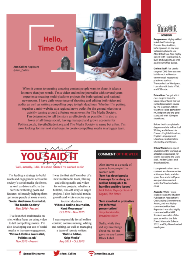
This CV got Jem an interview at Time Out for a social producer role – where they told her this CV was one of the main things that got her through the door. There’s often a lot of debate about whether or not you should design your CVs to look like a publication – our view is that it’s fine to if you can execute it to a hight standard, and don’t it at the expense of the content. Standing out is great, but no one wants a CV which is full of brand violations.
Jem told us that for this CV she literally got out a ruler and a copy of the magazine, to make sure the measures were exact to the millimetre (and to the bafflement of her flatmate who works in law). The CV also includes a whole range of experiences and skills which are relevant to the job she applied for her, with words that specifically echo those found on the job description. It’s also worth saying here that this CV very much echoes the feel of the publication – the reason this design and tone works is because it feels like TimeOut. You probably wouldn’t take the same approach for The Times!
